Eight Hues of Blue
Blue. We’ve used the colour often. In bedrooms, drawing rooms, dining rooms, kitchens and bathrooms. The shade has completely dominated some rooms, only touched a wall in others and sometimes lent it self even more minimally to just a skirting, a door or a window.
Widely available now, there was a point in history when blue was rare and the most expensive colour. The production of the pigment then was costly and blue came to be associated only with the rich and the divine. This changed with the advent of the industrial age when cheaper blue pigments became easily available, not least in paint. Today there are numerous shades of blue on a single paint fan deck and we’ve used a whole range of them for offices and homes. Also evocative of peace and tranquility, it’s a colour most of our clients are comfortable living with. When we use blue in our work, we use the shades keeping in mind the context of an Indian home. India is famously known for its relationship to the colour blue through the Indigo trade and its portrayal of “blue Gods” such as Vishnu, Shiva and Krishna. That makes it is easy to use the colour contextually in most Indian spaces.
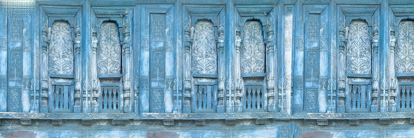
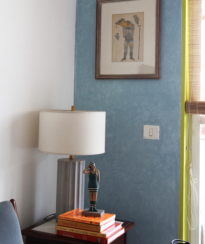
The images shared here use blue from western paint shade cards that have been adapted to an Indian story. We’re sharing the exact colours of blue we’ve used in our rooms as many people have asked us to share the paint colour codes. The first image is a part of wall mottled which uses two shades of blue from Dulux to imitate some of the faded walls we used as references from Navalgarh, Rajasthan. The second is of a photo from our studio in Goa. The blue tiles from Jaipur and the ceramic fish is from Goa have been paired with their closest matches on Pantone and Dulux fan-decks . The third picture is of a modern apartment in New Delhi, the handloom bedspread in navy blue adds a Desi touch. And the last image, a mood-board with a range of grey blues is inspired by a Delhi winter and nostalgia.
The wall was hand mottled by a painter. Mottling typically requires two or more shades of a colour.

Blueberry Mash by Dulux is the darker shade

Windswept by Dulux is the undertone
The blue of a Neerja pottery tile in Jaipur stands out on a coffee table in our Goan studio

Pantone 0900ff is a close match to the blue on the Neerja pottery tile

Sea Note by Dulux is an undertone on the Ceramic fish plate from the Museum of Goa
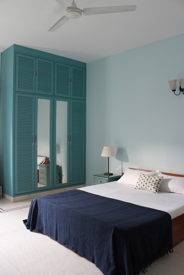
This bedroom in a New Delhi apartment employs a range of blues

Skywatch. by Dulux is the colour on the walls

California Days by Dulux is the colour on the cupboard
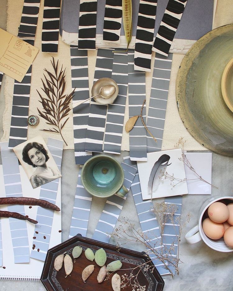
This mood board was inspired by nostalgia and Delhi in the winter, both of which usually bear hues of blue grey

Bays Water by Dulux is present in the darker tones on the moodboard

Angora Blue by Dulux is a softer blue grey that you see