Very Peri in Indian Decor
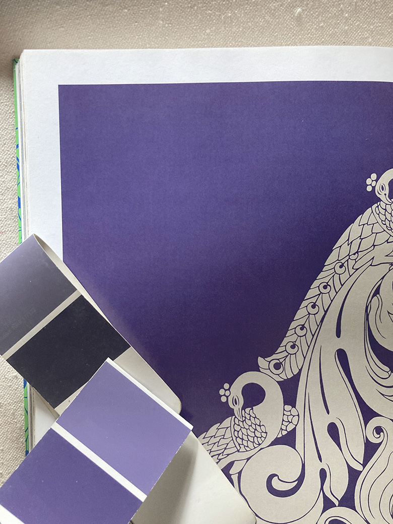
Very Peri is a happy, yet somewhat intense colour. Very Peri is a blend of gravitas and fun together. It’s the colour one sometimes sees in a sunset, or in the Clematis vine and Hydrangeas that grow in the Indian hills. And it is the Pantone colour of the year.
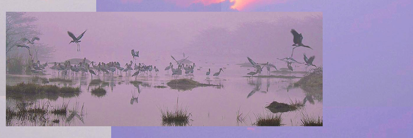
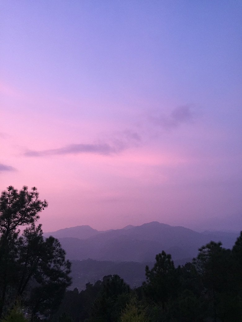
We were recently asked to share some ideas about Very Peri by a newspaper. That got us searching through an archive of our photographs of work and natural landscapes of India for references of the colour. We found Very Peri with little effort in numerous pictures — a sunset captured in the cool, still evening air of Almora, in a picture of a morning spent watching migratory birds in Sultanpur and in corners of many rooms we’d decorated. Having searched for it once, Very Peri now seems to appear almost everywhere, in markets, on walks through nature, in fabric, furniture and walls. It’s a colour we’ll be using in the future and not only because of it recent popularity, but because of its ease of use. The depth of this colour is appealing, as is its tempered exuberance, making it a good colour to use on walls and decor in adult and children’s rooms alike.
We’ve put together a series of pictures from work that have elements of Very Peri and would love to hear from you about how much Very Peri you can now see in your daily life.
Very Peri and related hues
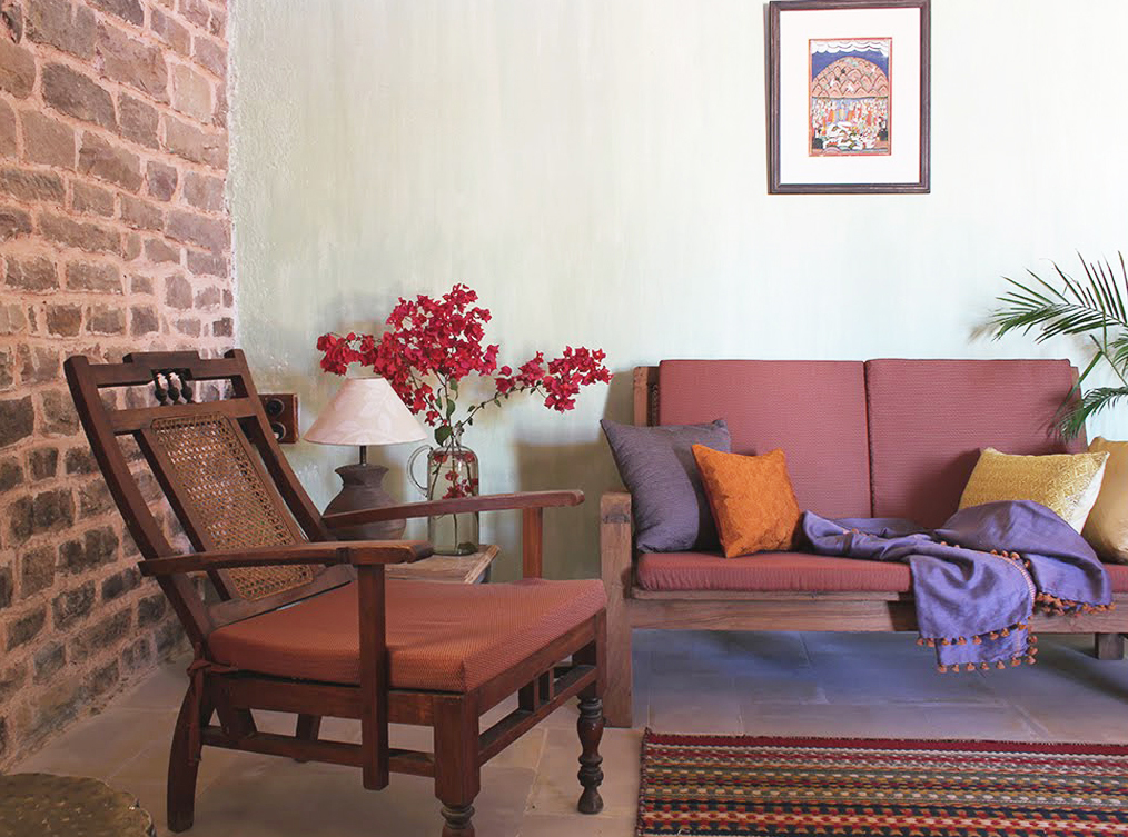
A cushion and a throw carry tones of Very Peri in a restoration project we were a part of in Scindia School, Gwalior
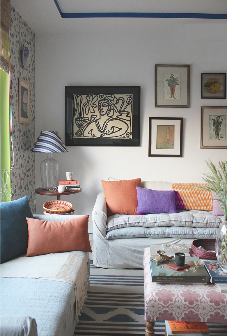
A sitting room in Gulmohar Park, New Delhi designed by us has an eye catching Very Peri cushion cover, also designed by us.
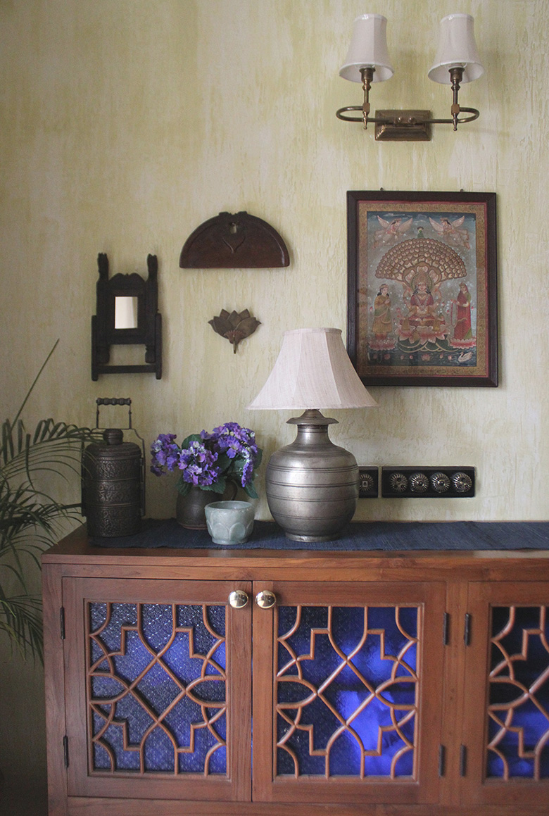
Flowers in Very Peri hues adorn an heirloom vase in this dining room decorated by us in Gurgaon.
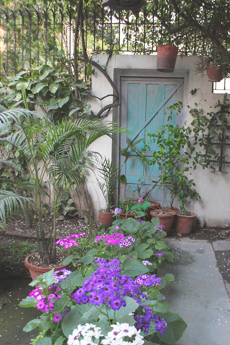
Cineraria in hues of Very Peri line this small back garden in Shanti Niketan, New Delhi.